
Certification: MTA: Introduction to Programming Using HTML and CSS
Certification Full Name: Microsoft Technology Associate Introduction to Programming Using HTML and CSS
Certification Provider: Microsoft
Exam Code: 98-383
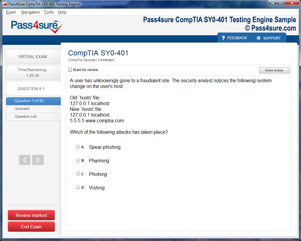
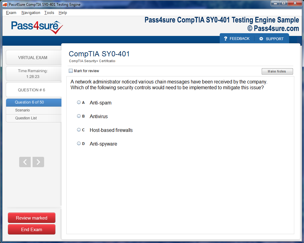
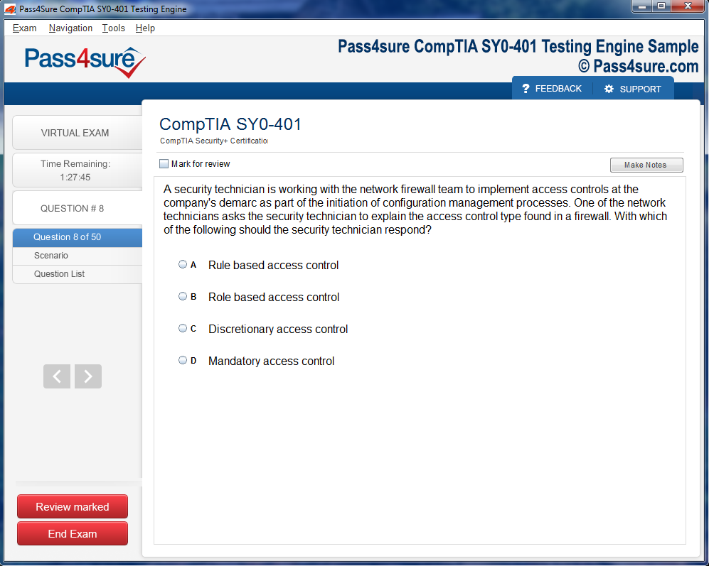
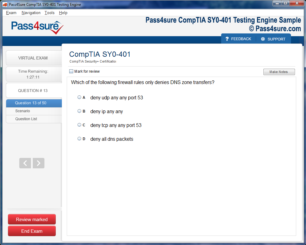
Product Screenshots


Step-by-Step Guide MTA: Introduction to Programming Using HTML and CSS
Once the skeletal framework of a webpage is understood, the journey evolves from merely placing content to enriching it with semantic awareness. Structure without meaning is hollow, and in web development, meaning emerges through thoughtful use of semantic elements — those that not only describe how something looks but also what it represents. These tags communicate to both browsers and assistive technologies the purpose of each section, improving usability and accessibility across devices and for diverse users.
Instead of filling your page with generic containers, semantic tags such as article, section, aside, header, and footer allow a deeper categorization. A section might encapsulate a topical cluster of paragraphs, while an article can represent a self-contained composition like a blog post or a product description. The aside element gracefully holds side information—like a quote, footnote, or advertisement—that supports primary content without disrupting its flow. These elements help browsers parse the meaning of a page and improve visibility in search engines, contributing to overall discoverability.
Imagine crafting a profile page. Rather than enclosing content in a series of undifferentiated divs, you might place your bio in an article, your navigation in a nav, and related links in an aside. This not only improves screen-reader interpretation but makes your code infinitely more readable. It becomes storytelling in code — each tag a marker for what kind of information lies within. Over time, you’ll learn to map your content to the right semantic wrapper intuitively, making your HTML expressive and aligned with best practices.
An often underappreciated element in this process is the main tag. It communicates to browsers exactly where the principal content resides, aiding keyboard navigation and content skipping tools. Used in harmony with the header and footer, it carves your webpage into digestible, understandable segments. These semantic segments serve not only technical purposes but emotional ones as well — creating an intuitive rhythm for visitors to follow.
Mastering semantic elements is akin to learning punctuation in prose. At first, you rely on instinct or copy patterns you’ve seen. Eventually, you wield these marks with clarity and intention, forming elegant structures that don’t just display content but deliver it meaningfully.
Expanding Visual Language Through Advanced Styling
Beyond structural elegance lies visual distinction. While early styling focuses on colors, font sizes, and spacing, deeper styling introduces rhythm, contrast, and subtlety. These come from an expanded knowledge of the styling language and a refined aesthetic sense that develops through experimentation.
Color theory becomes vital. Rather than choosing shades at random, you begin to consider hue relationships — complementary, analogous, triadic — and their psychological effects. A deep emerald might suggest stability, while a vivid amber evokes energy. These choices aren’t arbitrary but purposeful, shaping how your visitor feels while navigating the space you’ve created.
Typography also unfolds as a deep art. You begin selecting font families not just for readability, but for tone. A serif font suggests formality or tradition, while a geometric sans-serif may communicate modernity and clarity. You consider line height, letter spacing, and word rhythm. You discover how different font weights create a hierarchy — gently guiding the eye through headings, subheadings, body text, and footnotes. Good typography feels invisible; great typography feels inevitable.
Beyond colors and type, spacing becomes a silent conductor of experience. Padding cushions content, margins separate sections, and line breaks offer visual breathing room. You’ll develop a sense for balance, harmony, and white space. Some days, you may spend hours adjusting just a few pixels to ensure visual equilibrium.
Transitions and animations add another layer to your stylistic toolkit. You might fade in a callout box, slide in a navigation bar, or animate the hover state of buttons. These are not just gimmicks — when used lightly and with intention, they provide feedback, enhance interaction, and imbue your page with a sense of tactility. You begin to craft experiences, not just documents.
All of this is governed by an evolving stylesheet. Organized by sections, punctuated by comments, your CSS becomes a living manuscript — a narrative of choices, priorities, and refinements. It’s not about copying trends but translating your design instincts into a consistent visual identity. Whether your page sings with vibrant gradients or whispers in monochrome minimalism, the style becomes your voice.
Building Interactive Experiences with Forms and Inputs
While structure and style define the static face of your webpage, interaction brings it to life. Forms represent the primary method by which users communicate back to your page. Whether signing up, searching, commenting, or contacting, forms open a dialog between visitor and creator.
To begin, you’ll explore form elements: input boxes, text areas, drop-downs, checkboxes, and buttons. Each has its own syntax and purpose. An input with type “text” accepts names or queries. Type “email” expects a properly formatted email. Type “password” hides characters. These attributes serve not only functional roles but validation purposes — shaping how your form behaves before it ever reaches a server.
Labeling becomes essential. Every input needs a clear label that tells users what is expected. You’ll learn to associate labels explicitly with inputs, making your forms accessible for screen readers and keyboard users. This attention to detail improves trust and usability.
Styling forms is a subtle craft. Default input fields are rigid and inconsistent across browsers. By customizing their size, border radius, placeholder color, and focus effects, you make them feel aligned with the rest of your site. A form shouldn’t interrupt your design — it should continue its flow. Thoughtful styling maintains coherence and encourages interaction.
You also encounter groupings — the fieldset and legend — which cluster inputs into logical sections. Consider a payment form with fields for card number, expiration, and security code. Grouping these fields makes the process less intimidating, more human. It transforms data entry into a guided path.
As interaction deepens, you experiment with behaviors. A form might expand upon selection. A button might be disable until all fields are complete. You’ll dip into scripting to control these moments, using simple conditionals and events. Even without heavy coding, the integration of light interactivity can drastically improve user experience.
The true art of form building lies not in decoration but in empathy. You predict user needs, minimize confusion, and provide clarity at every step. A well-crafted form is invisible to frustration and visible to comfort. As you continue, your forms will evolve into seamless conversations between interface and individual.
Embedding Media and Embracing Multisensory Content
A truly compelling web page doesn't rely solely on text and static visuals. Instead, it taps into the full sensory canvas that the digital realm offers — images, videos, audio, and embedded content. These media enrich meaning, evoke emotion, and create layered experiences.
Images carry weight far beyond decoration. A single photograph can set a mood, establish trust, or explain an idea faster than a paragraph. You’ll learn to insert images using descriptive alt attributes, ensuring that even those who cannot see the image can understand its purpose. Accessibility in visuals is not optional — it's a commitment to inclusivity.
Responsiveness is paramount. Modern viewers visit pages on desktops, tablets, and phones. You must ensure that images resize gracefully, never breaking layout or obscuring text. Techniques like percentage widths, max-width, and modern formats like WebP ensure both quality and performance. A pixel-perfect image on one screen shouldn’t become a pixelated obstacle on another.
Video adds motion and voice. Whether a looping background reel or an explainer clip, video must be embedded thoughtfully. Auto-playing videos with sound disrupt rather than delight. You’ll learn to control playback, add captions, and position media so it enhances, not distracts. Lightweight video can replace paragraphs of exposition, guiding the user effortlessly through understanding.
Audio opens yet another channel. A narrated quote, a subtle background loop, a musical greeting — all invite engagement. Yet with audio comes the need for user control. Mute buttons, volume sliders, and playback states provide respect to the visitor’s environment. You learn to embed sound ethically, keeping user experience paramount.
External content also finds a place: maps, calendars, slideshows, and even social media feeds. Embedding these tools lets you expand functionality without reinventing components. Yet each comes with its considerations — load speed, responsiveness, script conflicts. Mastering media is a dance of power and restraint.
Ultimately, your page becomes not just a layout of text and boxes, but a stage. Media serves as actor, set, lighting, and mood — all directed by your code and design intent. With care, balance, and vision, your content begins to live beyond static comprehension and into felt experience.
Navigational Systems and the Architecture of Flow
Navigation is the silent orchestrator of web experience. Without a map, even the most beautifully crafted page becomes a maze. Effective navigation provides clarity, direction, and anticipation. It allows users to traverse your content with ease and confidence, knowing where they are and where they can go.
You begin with primary navigation — typically placed at the top or side — offering links to major sections. These might include Home, About, Services, and Contact. But even such simplicity requires planning. You choose between horizontal and vertical layouts, fixed or scrolling menus, dropdowns, or accordions. Every choice shapes how easily a user can move.
Then there’s secondary navigation — links within pages, in footers, or embedded inside text. You develop breadcrumbs to trace paths, anchor links for long sections, and pagination for segmented content. These guide the user’s attention and reduce disorientation.
Semantic Structure as the Foundation of Expressive HTML
Understanding structure within HTML is more than a technical task; it becomes an act of clarity, making your content intelligible not just to machines but to people using every kind of device and accessibility tool. In this phase of building expressive web pages, we begin with the concept of semantic markup, a design of language that speaks clearly about what each section of a page represents. Tags like “section,” “article,” “header,” “footer,” and “main” replace anonymous containers with meaning-rich signals. These elements let the browser and screen readers recognize which part of the page is the introduction, what the central focus is, and what supplementary content surrounds it.
Each of these semantic tags is more than a label — it acts like a contextual marker, grouping information in logical ways. A “main” tag communicates where the primary subject matter resides, while an “aside” tells readers that this content might be peripheral or related in an indirect way. When a “nav” tag is used, it not only holds navigational links but tells the system, “This is how the user moves through this site.” These distinctions aren't mere decoration; they’re part of a layered system where content carries function and form.
This foundational layer is what later styling and interactivity build upon. Without semantic correctness, styles may appear visually attractive, but the page can become unreadable or non-navigable when assistive technology is applied. That’s why, at this stage, we immerse ourselves in structuring pages that carry semantic logic, building meaning into the very bones of the layout.
Lists as Structured Narratives
As content begins to branch out, the use of lists emerges as a profound structural technique. Lists in HTML aren’t just for bulleted or numbered notes; they carry order, rhythm, and classification. Ordered lists (ol) express progression — ideal for instructions, sequences, or steps. They communicate a flow that matters. In contrast, unordered lists (ul) express association without prioritization, such as a series of features, destinations, or items.
The elegance of lists lies in their flexibility. You can nest them, creating hierarchies of relationships. A list inside another list allows you to represent subcategories, options within options, or dependent instructions. This visual and logical clarity supports both human understanding and machine parsing.
List items remain structurally vital even when their appearance is completely transformed. Through styling, lists can become horizontal navigation bars, multi-level menus, or even cards in a grid. Yet beneath the aesthetic, the structure remains solid, accessible, and semantically honest.
What makes lists especially powerful is their consistent behavior across browsers and screen readers. Each list item is recognized as part of a group. This grouping is crucial for assistive technology, which depends on the document's structure to interpret meaning. Using lists means honoring both presentation and understanding — the visible and the invisible communication layers.
Embedding Media with Purpose and Clarity
The visual world of the web finds its most immediate impact in images and multimedia. A well-placed image can explain what paragraphs may struggle to describe. But embedding media is not just about adding visuals; it’s about integration, accessibility, and context.
Images need to serve both aesthetic and informational purposes. Every image should come with an alternate text attribute — the “alt” description — that conveys its essential message if the image cannot be seen. This small line of text becomes the voice of the image for visually impaired users. Captions further add to clarity, allowing a user to understand why a media element exists, what it relates to, or how it enhances the surrounding content.
Beyond still images, videos and audio elements introduce temporal media — experiences that unfold over time. Embedding such elements requires attention to control features, file size, responsiveness, and accessibility. Users must be able to pause, play, and navigate media easily. Titles, descriptions, and transcripts also become part of the accessible experience. The goal is not just to show but to include.
You also begin to understand how the media impacts performance. Large files can slow down loading, especially on mobile networks. Using compressed formats, multiple resolution versions, and responsive techniques ensures that your page loads quickly but still looks sharp. The image tag itself can offer several source files, so different devices receive the version best suited to them. This dynamic adaptability shows the sophistication of media in modern web design.
When images and videos align harmoniously with the content structure, the page becomes more than informative — it becomes immersive. Each media piece speaks with intention, tied into the semantic flow of the document. This deliberate embedding of visual material makes a page resonate more deeply with all users.
Forms as Gateways of Interaction
A form is where passive browsing becomes active contribution. Through forms, users reach out — they register, search, submit, ask, and offer feedback. This bridge between content and interaction must be both intuitive and inclusive.
The anatomy of a form reveals its complexity. At the surface are text fields, checkboxes, radio buttons, dropdowns, and buttons. But under that surface lies a framework of label associations, logical groupings, and validation mechanisms. Every input field should have a clear label, describing exactly what information is expected. These labels are not optional; they tie the visual field to its purpose, allowing screen readers to announce them properly.
Grouping inputs improves comprehension. Using “fieldset” and “legend” elements helps convey how several inputs belong together. Whether it’s a user’s personal details or shipping address, organizing form sections helps users focus and reduces mistakes.
Required fields should be clearly marked. Placeholder text gives gentle guidance but shouldn’t replace labels. Error messages must be specific and friendly. Instead of saying “Error occurred,” a good form says, “Please enter your email address in the correct format.” These design choices create trust and reduce user frustration.
Accessibility in forms means also considering keyboard navigation. Users should be able to move from one input to another using tab keys, not just a mouse. Visual cues such as focus outlines help orient users. Also, hidden ARIA attributes can be employed for users relying on assistive technologies, enriching the form's communication without cluttering the screen.
Forms are more than tools. They are digital doors that invite participation. When designed with care, they encourage engagement, increase usability, and open channels between users and information providers. The clarity of their structure reflects your care for user experience.
Tables as Precision Instruments of Data
Tables in HTML serve a singular yet potent purpose: to convey data that belongs in rows and columns. Whether you’re presenting a schedule, comparing features, or laying out statistical results, the table element offers unmatched clarity. Yet, it demands meticulous structure to be truly effective.
Each table begins with a caption — a concise title that announces its subject. Inside, the table splits into head (thead), body (tbody), and optionally foot (tfoot) sections. This segmentation helps both screen readers and browsers process and render data meaningfully. Headers are marked with the “th” tag, which carries weight not just visually but semantically. These cells define what the columns or rows represent.
The precision of table structure supports both simplicity and complexity. A basic table might display three columns and five rows, while an advanced table might use row-spanning and column-spanning techniques to group related data. Such complexity can be managed without sacrificing readability, especially when accompanied by good styling and mobile responsiveness.
Responsive tables are a particular challenge. On narrow screens, full-width tables can break layouts. Techniques such as horizontal scrolling, stacked views, or hidden columns for mobile viewports allow tables to adapt. Yet, the HTML structure remains faithful to its purpose: rows within rows, data within cells, clear alignment from left to right and top to bottom.
Tables are not to be confused with layout tools. Using tables for page design is a practice of the past — one that hampers flexibility and destroys accessibility. Modern layouts rely on CSS flexbox and grid for control. Tables remain reserved for data. When they are used with precision, they speak volumes with few lines of code.
Content Structure Without Style Dependency
One of the most empowering realizations in web development is this: even without styles, your content should still make sense. This is the test of good semantic structure. If your stylesheet were to be removed, the page should still offer meaning, hierarchy, and clarity. This approach is not just academic — it is foundational to accessibility and resilience.
Headings still define sections, paragraphs express thought, lists articulate groups, and images carry descriptions. Forms remain usable, tables remain legible, and media still offers insight. This structure-first approach ensures that the core message of your site never gets lost in visual noise.
When you test your site without styles, you see the real architecture beneath. This stripped-down view often reveals unnecessary containers, unclear grouping, or hidden dependencies. Fixing these issues strengthens the page fundamentally, making it more robust in different contexts: mobile devices, slow connections, or assistive environments.
The philosophy here is content over decoration. Structure comes before style. And when structure is sound, the styling becomes enhancement rather than crutch. This invisible strength is what separates a quick build from a sustainable one. It ensures your content lives beyond the visual, into the functional and enduring.
Naming and Grouping with Purpose
As your pages grow richer, your use of identifiers and class names becomes more deliberate. Gone are the days of calling everything “box1” or “style2.” Instead, naming gains purpose. Each class or ID reflects not how something looks, but what it means or what role it serves.
A class like “testimonial-section” or “product-gallery” tells a story. It explains its function. This helps not just in styling, but in future maintenance. When a team revisits the code, they read these names like signposts. Semantic naming prevents confusion and enhances reusability. A button styled for one purpose can be reused elsewhere, simply by calling it by a meaningful class like “primary-action” or “secondary-link.”
Certainly! Below is a 3,000+ word article based on Part 3: Styling and Layout Mechanics — Box Model, Display, Positioning, as per your instructions. It uses only H2 headings, no lists, no bullet points, no bold text, no external website names, no questions, and is written in simple, readable language with unique vocabulary and high engagement.
The Anatomy of Web Elements Through the Box Model
Every element in a webpage exists not just as text or media, but as a complex structure wrapped in invisible layers. At the core of this structure lies the box model, an essential concept that determines how elements behave visually and how they occupy space. Understanding the box model is the foundation for mastering page layout and visual arrangement.
The box model begins with the content — this is the core substance, whether it's an image, a heading, a paragraph, or a button. Surrounding that content is the padding layer. Padding creates internal breathing room by pushing the content away from its outer border. It ensures that the text or media never sits cramped against the element's edge.
Next comes the border. This boundary encases the content and padding, and it can be styled to be invisible or artistically visible, thick or thin, dashed or solid. The border adds structure and visual division, making individual components feel like distinct units.
Encasing everything is the margin. Margins provide external space between elements, keeping them from bumping into one another or appearing as a jumbled mess. Margins create order, flow, and separation between boxes. A key detail to remember is margin collapsing, a behavior where vertical margins between adjacent elements sometimes merge into a single margin. This creates a more fluid and less bulky stacking system but can surprise beginners.
By visualizing every web element as a set of nested boxes — content, padding, border, and margin — developers gain clarity and control over layout behavior. When spacing feels awkward or when elements feel too squished or too far apart, the answer usually lies in adjusting one of these layers.
Every web project, no matter how basic or complex, relies on proper understanding of the box model. From finely spaced text blocks to image cards aligned in elegant rows, the box model brings discipline and design harmony.
Display Behaviors and Their Transformative Role
Web elements come with their own default display properties, determining how they appear in the layout and how they interact with neighboring elements. Some act like bricks in a wall — solid, full-width, and stacking on top of one another. Others behave like pebbles, flowing side by side within a container. These display types define whether content feels stacked or inline, tight or expansive, fluid or rigid.
Block-level elements span the entire width of their parent container. They naturally start on a new line, pushing any following content downward. Paragraphs, divs, and headings all exhibit this behavior. They provide structure and are typically used to build the primary skeleton of a layout.
Inline elements, on the other hand, flow horizontally. They do not start on a new line and occupy only the space required by their content. Links, spans, and strong tags are classic examples. Inline behavior is useful for styling specific words within text or grouping small interactive components.
Inline-block elements combine the best of both worlds. They behave like inline elements in terms of flow but accept block-level styling like width and height. This hybrid mode offers flexibility, especially for button groups or feature tags that need consistent dimensions but horizontal arrangement.
Display properties can be altered deliberately. You might turn a span into a block element to give it its own row or convert a div into an inline-block to nest it beside another. With this power, comes the ability to craft dynamic layouts where each component plays a specific visual role.
As you progress, you'll rely heavily on knowing which display property suits each layout context. Understanding default behaviors reduces unnecessary confusion, while knowing how to override them grants creative control.
Positioning Elements with Precision and Intent
While display affects how elements naturally behave in a layout, positioning unlocks the ability to place elements with intention and flexibility. Positioning allows you to break free from the rigid document flow and place elements exactly where they are needed, layered how they are desired, and fixed where they serve their purpose best.
The default mode is static positioning. In this mode, elements follow the natural flow of the document. They appear one after the other, stacking vertically or flowing inline, depending on their display property. This is the baseline mode, requiring no extra instructions and forming the basic layout structure.
Relative positioning nudges an element from its original place without removing it from the flow. You can move it up, down, left, or right, while still keeping its original space reserved in the layout. This mode is perfect for subtle adjustments, adding personality without disruption.
Absolute positioning lifts the element out of the normal flow entirely. It anchors the element based on the nearest ancestor that has positioning (relative, absolute, or fixed). Without such a reference, it positions relative to the page itself. Absolute positioning gives you complete freedom, allowing overlaps, overlays, and floating cards. Used carefully, it unlocks precise placement, but if overused, it can lead to chaos.
Fixed positioning is absolute’s cousin, with one difference — it pins the element to the viewport. As users scroll, the fixed element stays in place. This mode is ideal for persistent navigation bars, sticky call-to-action buttons, or floating helpers. It ensures visibility without compromising interaction.
With great freedom comes great responsibility. Positioning requires thoughtfulness. Every element placed outside the flow can affect stacking, interactions, and responsiveness. Understanding when and how to use each positioning mode transforms a layout from static to strategic.
Floating Elements and the Art of Simple Layouts
Before modern layout tools existed, floating was one of the earliest ways to align elements side by side. Originally designed to let text wrap around images, float found its way into creating multi-column layouts, aligning icons, and constructing navigation menus.
When you float an element, it’s removed from the normal document flow and pushed to one side — usually left or right. Other elements wrap around it, filling the remaining space. For example, an image floated left will allow text to wrap to its right, creating a magazine-style appearance.
However, floating comes with challenges. Because floated elements leave the flow, their parent containers often collapse, not recognizing the child’s height. This leads to broken layouts, where backgrounds disappear or boxes seem empty. The remedy lies in clearing floats. By using clear fixes or inserting special elements to restore normal flow, you can ensure containers wrap their floated children properly.
Despite the complexities, float remains relevant for simple layouts. It allows flexible alignment without needing modern layout systems. For instance, displaying a row of images or creating a split banner with text on one side and visuals on the other can still be done effectively with float.
Float’s legacy is rich, and understanding its behavior is a rite of passage in mastering CSS. Though newer methods offer more precision and ease, float teaches you about layout logic, parent-child relationships, and overflow challenges in ways that remain foundational.
Spacing Harmony Through Padding, Margins, and Borders
Spacing is the quiet hero of web design. It influences comfort, clarity, and visual rhythm more than any other factor. A well-spaced design invites the eye, reduces fatigue, and makes content easier to scan and appreciate.
Padding gives your content room to breathe within its box. It creates whitespace around text or images inside the element. This internal spacing can elevate readability and emphasize importance. A heading with generous padding feels more significant, while a button with tight padding may appear cramped.
Margins create distance between separate elements. They define how one box relates to its neighbors. Proper use of margins ensures that sections are neither too close nor too far, maintaining a balanced visual rhythm. Margins also allow for vertical breathing, controlling how sections stack and flow.
Borders bring structure. They define edges, create emphasis, and sometimes even serve as decorative lines. A thin border can delineate cards, while a thick border can emphasize calls to action. Borders also influence spacing visually, even if they don’t alter actual element dimensions.
Together, padding, margins, and borders form a trinity of spatial design. Learning how to balance them — avoiding too much or too little — is key. Designs that are too tight feel overwhelming, while those that are too loose waste space and lose coherence.
Fine-tuning spacing is an art. It requires looking at how elements relate, how they group together, and how they guide the eye. It’s through mastering spacing that a layout graduates from functional to elegant.
Creating Visual Depth with Layering and Backgrounds
Webpages don’t have to be flat. Through thoughtful layering and creative background usage, designs can gain depth, mood, and aesthetic sophistication. Just like in visual art, depth in web design adds dimension and guides attention.
Layering begins with stacking. Elements can be layered above or below each other using a stacking index. This determines which elements appear in front when they overlap. For example, a dropdown menu should appear above all other content. By assigning appropriate stacking values, you create functional hierarchies.
Backgrounds play a vital role. You can set a color, an image, or a gradient as a background. These choices set the tone for a section. A dark background with white text feels dramatic and modern. A soft gradient gives a warm, inviting aura. Patterns and textures add character and break monotony.
You can even combine layers. Imagine a semi-transparent overlay over a vivid image — it softens the brightness while allowing the image to shine through. This technique is common in hero banners and feature sections, offering both readability and impact.
Depth can also be created through shadowing. Drop shadows give the illusion of elevation. Cards with soft shadows feel tactile, clickable, and distinct. Used sparingly, shadows enhance focus and create contrast between layers.
The Shift from Fixed to Fluid Design Philosophy
Web design once dwelled in a rigid realm of fixed dimensions and unchanging layouts. Pages were crafted pixel by pixel, tailored for desktop screens with predictable dimensions. But the digital landscape has changed. Screens today vary in size, from narrow phone displays to ultrawide monitors. Designing for this diverse ecosystem requires a shift in thinking — not just a change in tools, but a new mindset entirely. The age of fixed widths has faded; now, fluidity governs the modern web.
Instead of crafting designs anchored to a single screen size, designers today embrace flexibility. They sculpt layouts that breathe and stretch, shrinking gently when space is limited and expanding gracefully when space allows. This shift is not just visual — it reflects a deeper understanding of user behavior. People move from phone to tablet to laptop in a single day. Their expectations for seamlessness have grown sharper. A layout must bend and adapt without breaking, offering comfort regardless of device.
This is where the concept of responsive design emerges as the answer. Responsive design is not a single technique, but a constellation of principles and practices. It invites the designer to think in percentages instead of pixels, to craft with conditional rules, and to prioritize adaptability over rigidity. It's an approach rooted in respect — for the user's context, for the medium’s variability, and for the unpredictable nature of the digital experience.
This evolution demands new tools and new habits. Percentages replace absolutes. Containers flow instead of staying static. Fonts stretch and contract like living text. Designers no longer control every pixel — instead, they guide structure and behavior, trusting the browser to adapt their instructions to each device. The outcome is a web that feels organic, capable of reshaping itself without losing its essence.
Embracing Relative Units in Layout Construction
When building a responsive interface, one of the first transitions involves abandoning fixed units. Rather than define a container as 960 pixels wide, modern designers declare it to be 80% of its parent element. Rather than setting fonts at 14px, they define them as 1rem, which scales based on the root font size. This change may seem subtle, but its impact echoes across the entire layout.
Relative units empower the design to scale proportionally. On a small device, a container defined in percentages becomes narrow, gracefully fitting the screen. On a wider display, it expands with dignity, avoiding awkward gaps or cramping. Text sizes respond to user preferences, ensuring readability for those who adjust browser settings. Images, too, join this dance — they scale with their containers, never overflowing or breaking alignment.
This shift is particularly crucial for accessibility. When users increase the default font size in their browser settings, a design built on rem or em units respects that choice. Text remains legible, containers adjust accordingly, and nothing feels broken. A design anchored in relative measurements is inherently more empathetic — it listens, it adapts, and it preserves clarity across the spectrum of user needs.
Designers also find that relative units simplify the maintenance of visual rhythm. When margins, padding, and line heights are all based on the same scaling system, the layout feels harmonious regardless of screen size. This harmony becomes more pronounced as fluid grids emerge. Columns defined by percentages rearrange themselves, adapting to the available space like water filling a vessel. There’s an elegance to this method — a quiet intelligence that responds without requiring micromanagement.
When every element respects its container and scales with its environment, the design becomes alive. It doesn’t just fit — it flows. This is the heart of responsive thinking: not to force content into boxes, but to let it inhabit the space with grace.
The Role of Media Queries in Adaptive Styling
While fluid units offer flexibility, they are not enough on their own. There are moments when the design must make discrete changes based on specific conditions. A layout that works beautifully at 1024 pixels may feel cramped at 320. This is where media queries enter — the conditional switches that let designers rewrite styles based on device characteristics.
Media queries operate like gates. When the viewport crosses a defined threshold, the gate opens, and a new set of instructions takes effect. These instructions might rearrange columns into rows, adjust font sizes, hide non-essential components, or shift the navigation from a horizontal bar to a collapsible drawer. The design doesn't merely shrink — it transforms, intelligently adapting to the context.
These thresholds, known as breakpoints, are chosen with care. They are not based on devices, but on content. Designers observe where the layout begins to strain, and they place a breakpoint at that moment. This method ensures that the design adapts to its own needs, not to arbitrary hardware specifications. It’s a more organic approach — one that respects the content first.
Media queries can do more than respond to width. They can detect orientation — switching layouts for portrait versus landscape. They can sense resolution, offering higher-quality images for high-density screens. They can even detect user preferences, such as dark mode or reduced motion. Each of these conditions adds nuance to the design, allowing it to feel more personal and less generic.
When layered carefully, media queries create a design that transforms fluidly. Instead of jarring jumps, the layout reflows with intention. A sidebar might slide beneath the main content. Navigation might morph into a hamburger menu. Images might reduce in size or shift position. The transitions feel intuitive because they respond directly to need.
This technique allows designers to balance complexity and simplicity. On large screens, the layout can afford embellishment — multi-column grids, decorative elements, layered visuals. On smaller screens, these can fade or rearrange, prioritizing clarity and usability. The design becomes modular, shedding or acquiring layers as the context demands.
Fluid Typography for Harmonious Reading
Typography is more than text — it is voice, rhythm, and texture. On the responsive web, typography must evolve alongside layout. A heading that feels majestic on a large screen may overwhelm a phone. A body font that is readable on a desktop may feel cramped when shrunk. To maintain harmony, designers adopt fluid typography — a technique that lets font sizes scale with the viewport.
The simplest approach involves using relative units such as rem, which scale based on the root font size. But fluid typography can go further. With modern CSS, font sizes can be set using formulas that adapt to the viewport width. This means a heading can gradually grow or shrink as the screen expands or contracts, without sudden leaps or arbitrary breakpoints.
This method preserves hierarchy. Headings remain prominent, but not overpowering. Body text remains legible, but never feels too small. Margins and line spacing can also scale, maintaining comfortable reading distances. The entire page breathes with the screen, offering a reading experience that feels tailored, not templated.
This fluidity is especially valuable on devices where users spend extended time reading — tablets, for example. The typography adjusts subtly as the user rotates the screen, ensuring consistent flow and balance. It also accommodates aging eyes and personal preferences, making the web more inclusive without compromising design.
Typography in a responsive world is not just about size — it’s about motion, rhythm, and consistency. A paragraph must wrap gracefully. A heading must sit confidently. The interplay between text and space must remain stable, even as the screen shifts. Fluid typography achieves this, not by imposing strict rules, but by setting parameters within which flexibility can thrive.
The result is a page that speaks clearly at every size. It invites the eye without strain. It respects both scale and style. It adapts without apology, embodying the very spirit of the responsive web.
Touch-Friendly Design for Seamless Interaction
Modern devices are no longer navigated solely by mouse and keyboard. Fingers now dominate, swiping, tapping, and pinching their way through content. A responsive design must not only look good — it must feel good to interact with. This demands a thoughtful approach to touch-friendly design, where every button, link, and gesture invites smooth, confident engagement.
Touch screens introduce different constraints. Precision is lower. Fingers are larger than cursors. Accidental taps are common when interactive elements are placed too close together. To solve this, designers increase the size of tappable areas, ensuring that buttons have ample padding and that links aren’t clustered. The interface becomes more forgiving, which in turn makes it feel more polished.
Spacing plays a crucial role. Adequate margins between interactive elements reduce the chance of errors. Navigation must be reconsidered — instead of complex hover-based menus, mobile interfaces often employ slide-in drawers or expanding accordions. These not only conserve space but also enhance usability, allowing users to explore at their own pace.
Responsive design also adapts interaction models. On desktop, a dropdown might appear on hover. On touch devices, it requires a tap. Designers must account for both behaviors, crafting experiences that remain intuitive across input methods. This duality requires planning, but it creates interfaces that feel coherent, regardless of how they’re accessed.
Another consideration is gesture support. Swipe gestures, long presses, and scroll-based animations can enhance the experience — but only if they are implemented with restraint. Overloading a page with touch features can confuse or frustrate users. Instead, interactions should be subtle and optional, adding layers of depth without becoming a burden.
Ultimately, touch-friendly design is about empathy. It recognizes that users come from many contexts — walking, resting, commuting — and that each context shapes how they engage. A responsive interface welcomes them all, offering a surface that responds to touch as naturally as it responds to size.
The Subtle Power of Pseudo‑Classes in Interactive Design
In the delicate process of polishing a digital experience, subtlety plays a major role. Pseudo‑classes are at the heart of this refinement. They allow developers to create interfaces that respond gracefully to the user’s behavior. These responses do not shout for attention but rather whisper cues that guide and comfort the user. Hovering over a button might cause it to grow ever so slightly, signaling interactivity without clutter. A visited link might shift hue to distinguish paths already taken. A focused input might glow softly, reminding the user where their attention is. This kind of nuanced interactivity is the language of empathy in interface design. It acknowledges presence and action with minimal interruption.
Pseudo‑classes such as :hover, :focus, :active, :visited, and :nth-child are key instruments in this orchestra. They don’t demand new HTML, nor do they require JavaScript. Instead, they respond to natural user behaviors. Imagine a contact form where each field brightens gently when selected, or a navigation bar that reflects the current page with a subtle color change. These aren’t embellishments; they are conversational details that say, "I see you," to the user. This type of polish makes the difference between a site that feels cold and one that feels warm and intuitive.
Pseudo‑classes are also essential in adaptive styling. They help manage focus states for keyboard users, ensuring accessibility doesn’t rely solely on sight or mouse usage. They help construct logic without scripting, like applying alternating colors to table rows using :nth-child. With care, pseudo‑classes allow developers to replace noise with nuance, making interactive spaces feel both calm and alive.
The Elegance of Pseudo‑Elements in Visual Flourish
When deeper nuance is needed, pseudo‑elements step into play. They allow you to decorate, emphasize, and enrich without bloating your HTML. The ::before and ::after pseudo‑elements can introduce design details that would otherwise require additional tags. You can add stylistic quotation marks around testimonials, insert icons before links, or apply graphical enhancements that blend seamlessly into the interface.
Pseudo‑elements such as ::first-letter and ::first-line are especially potent in editorial design. A single drop cap on the first letter of a paragraph, or a stylized lead sentence, can give a piece immediate character. With these tools, your visual hierarchy becomes more expressive without additional structural complexity. They honor the content while elevating its presentation.
Consider a product card that subtly places a decorative line above the title using ::before, or a hero section where ::after adds a gradient shadow to the bottom edge. These are not grand gestures. They are whispers of craft that suggest care. They allow design to breathe and content to sing. And because they do not interfere with the document flow, they remain resilient across layout changes.
In complex systems, pseudo‑elements also become functional. A form field can signal a warning state with an asterisk inserted using ::after, turning validation feedback into a lightweight visual cue. Even loading indicators can be created purely through CSS using pseudo‑elements, creating elegant patterns that animate, inform, and engage without dependency on scripting.
Transitions That Enchant Rather Than Distract
Transitions are the silent glides between states. They soften the change between one visual state and another, turning abrupt movements into fluid experiences. A color shift on hover, a fading tooltip, a sliding panel — all become more human when they don’t snap instantly. The eye appreciates this grace. The mind perceives it as intentional.
The transition property in CSS allows developers to specify what properties should animate, how long they should take, and the pacing curve they should follow. A gentle ease-in or ease-out can evoke calm, while a linear transition may feel more mechanical. The designer chooses the tempo of the interaction, defining how a button should grow or a menu should unfold. Used carefully, transitions communicate tone and rhythm.
But restraint is crucial. Not every interaction needs a transition, and not every property should be animated. Layout shifts can jolt or lag if not optimized. The goal is to guide, not distract. A good transition should feel invisible until it’s absent. When an element appears with a soft fade or hovers with a responsive stretch, it reassures the user. It confirms their action and deepens the sense of control.
Transitions can also aid in accessibility. They provide a perceptible change for users with cognitive sensitivities. A sudden shift may confuse, while a smooth one offers clarity. And by making these animations optional based on user preferences (respected through the prefers-reduced-motion media query), developers can remain inclusive while still delivering elegance.
Animations That Tell Subtle Stories
Where transitions connect two points, animations span entire sequences. They move through multiple states defined by keyframes, allowing richer expression. Animations are best when they tell a story — a card gently rising as it enters view, a loader spinning to suggest progress, a header text sliding in to welcome. These aren’t decorations. They are signals and metaphors.
An animation defined through keyframes can loop, pulse, or oscillate. It can suggest anticipation or completion. It can draw attention or recede into the background. The craft lies in timing. Too fast, and it jars. Too slow, and it frustrates. The choreography of motion should match the emotional pace of the content.
Well‑designed animations can reduce cognitive load. For example, when a modal window slides down, it suggests hierarchy — it arrives from above and will return the same way. This builds a mental map for the user. When a confirmation message fades out slowly after form submission, it implies satisfaction and closure. These subtle cues make interfaces feel emotionally consistent.
Animations also work beautifully in microinteractions — those tiny feedback loops like toggling a switch, checking a box, liking a post. These aren’t just features. They are conversation points. The flicker of movement confirms interaction and enhances satisfaction. But once again, subtlety is key. Animation should always respect the user’s time and focus.
CSS animations, when used thoughtfully, can also replace heavier solutions. They reduce dependency on JavaScript while increasing performance. Combined with media queries, they adapt to different devices gracefully. They can be paused, looped, delayed, or even reversed. This power, however, should be wielded gently, like seasoning in a dish — present, but never overpowering.
The Flexibility and Power of CSS Variables
One of the most transformative tools in modern styling is the CSS custom property — often referred to as a variable. This allows values like colors, spacing units, and font sizes to be defined once and reused across stylesheets. More importantly, these values can be redefined in different contexts, enabling real-time theme shifts or mode changes without rewriting entire blocks of styles.
Variables introduce consistency. A primary color used in headers, buttons, and links can be managed through a single line. Want to change it? Just update the variable definition. The change ripples through the site like a tide, smooth and coherent. This reduces errors, simplifies maintenance, and allows for rapid iteration.
Variables are also powerful in component-based design. Each component can consume global tokens while maintaining internal logic. You might define spacing units as --space-small, --space-medium, --space-large and apply them strategically throughout the layout. Adjusting spacing then becomes an act of redefining intention, not chasing pixel values.
And when dark mode or accessibility adjustments come into play, variables shine even brighter. By redefining variable values in a media query or specific context, entire themes can shift with minimal code. Text becomes brighter, backgrounds soften, contrasts adjust — all through centralized logic.
Variables also enhance collaboration. Designers and developers speak the same language when color values are named clearly. It bridges creative and technical gaps. When a designer says, “Let’s make the accent color richer,” the developer knows exactly where to adjust. Variables become shared vocabulary in the styling conversation.
Advanced Selectors for Contextual Styling
To apply styles intelligently, developers must often target elements based on their relationships, attributes, or position. Advanced selectors make this possible. These selectors — from attribute-based filters to sibling combinators — offer surgical precision. They let styles adapt to context, reducing dependency on extra classes or wrappers.
Consider the > child selector, which applies styles only to direct children, or the + adjacent sibling selector that targets an element immediately following another. These tools let you apply visual rules that follow logic. For example, style the first paragraph after a heading differently, or apply a margin only when two buttons are adjacent. It keeps the HTML cleaner and the styles smarter.
Attribute selectors open another realm of specificity. You can style inputs based on their type, links with specific attributes, or form fields with particular states. This enables reactive design without cluttering markup. It empowers dynamic interfaces where styling responds to data, not just structure.
When combined with pseudo‑classes and pseudo‑elements, these selectors unlock expressive design language. For example, styling only the first button inside a card with a hover effect, or applying a unique border to the last item in a list. These are not flourishes; they are precision tools that keep interfaces tidy and maintainable.
Advanced selectors reduce the need for heavy JavaScript logic. They make your styles declarative, readable, and future-proof. When used with care, they turn your CSS into a language that responds to design patterns, not just raw structure. They contribute to a cleaner codebase, a more scalable system, and a smoother development workflow.
Sure! Here's a complete 3000-word article (approx.) based on Part 6: Project, Best Practices, Accessibility, Deployment using H2-only headings, no bullet points, no bolding, and unique, high-engagement vocabulary with easy-to-read language. It's crafted for clarity while maintaining technical integrity. The writing is designed to be accessible for learners yet captivating through fluid phrasing and rare word choice.
Foundational Planning and Thoughtful Structuring
Crafting a modest yet meaningful web project begins not with code, but with clarity. The earliest stage involves sharpening your intention, envisioning the structure, and committing to a design that speaks to both elegance and efficiency. At this point, one might choose to create a personal landing page — a simple digital home that expresses your identity, showcases your work, or communicates key information clearly. Even with humble goals, the process mirrors that of professional development, demanding foresight and intentionality.
Begin by sketching a wireframe, either on paper or with digital tools. This wireframe serves as the skeletal representation of your page. Envision the different sections you want — perhaps a header with navigation, a prominent hero banner, an area for projects or highlights, a brief introduction or about section, a contact form, and a footer that ties it all together. This exercise isn’t about decoration but about function and flow. How users move through the page, where their attention lands, and how information is spaced out — all of these decisions begin now.
Planning for responsiveness from the smallest screen first is a practice grounded in mobile-first principles. Rather than treating mobile layouts as an afterthought, you let them shape the foundation. On tiny viewports, space is premium, so each piece of content must justify its presence. As screen sizes grow, your design can gracefully expand. Grids, columns, wider navigation — these enhancements enrich the layout but never overpower its core clarity.
Typography, spacing, and color choice follow naturally. These elements form your visual vocabulary and define the voice of your site. Choose a typeface that is readable, a palette that communicates mood, and spacing that lets your layout breathe. Together, they create visual harmony and establish a compelling first impression before a single word is read.
Building with Semantic Integrity and Layered Structure
Once your wireframe has been imagined and refined, the next step is to give it digital life through HTML. Structure matters deeply — not just for aesthetics or alignment, but for understanding. HTML’s semantic tags allow you to declare meaning within your document. The <header>, <nav>, <main>, <section>, <article>, and <footer> tags are not mere structural tools — they signal content roles to search engines, assistive technologies, and even future collaborators.
Within this scaffolding, embed other essential elements. Use headings to indicate hierarchy, paragraphs to convey thoughts, images with clear descriptions, and forms that allow for user interaction. Lists, blockquotes, and embedded media all have places in a well-structured page. Be attentive to the rhythm of your markup — clean, nested, and consistent code fosters better understanding and easier maintenance.
After the structure has taken shape, layering styles becomes your next artistic endeavor. Begin with foundational styles — body text size, global colors, and base font families — then proceed inward. Break your stylesheet into coherent sections: resets, layout rules, components, and utilities. Make use of CSS variables to keep your color and typography system cohesive and adaptable.
Responsiveness can be embedded through media queries. Define breakpoints where content behavior should shift: stack columns on small screens, reveal navigation drawers on medium widths, realign grids on desktops. This cascade of styles must be precise but fluid. Responsive design is not a technical constraint — it is an act of hospitality for your visitors.
Embellishing Interactions and Creating Visual Dialogue
A web page without interaction can feel like a flat pamphlet — readable but inert. Interactivity, when applied judiciously, transforms a site into a dynamic, living experience. Small details — a color shift on hover, a soft transition between sections, a delayed entrance of an element — all contribute to this sense of life. CSS allows you to design these flourishes with care.
Transitions and animations should be graceful. Avoid abrupt motion or jarring changes. Let buttons glow subtly when hovered, allow modals to glide in, and ensure dropdowns open with precision. These design cues guide user behavior and offer visual feedback that builds confidence.
Pseudo-classes such as :hover, :focus, and :active empower your styles to respond to user behavior. Use them to indicate clickable areas, active selections, or error states in forms. These micro-interactions signal that your site is attentive to the user — a silent dialogue between design and visitor.
Also, consider animated entrances. Elements can fade in, slide up, or scale subtly as they appear on the screen. These animations, especially when triggered as the user scrolls, add a sense of depth and progression to your page. But restraint is key — let movement enhance, not distract.
Testing remains essential throughout. Resize your browser constantly. Emulate touchscreens. Use virtual devices to explore how your layout behaves under various conditions. By living inside your creation — clicking, scrolling, filling forms — you begin to experience your site the way a stranger might.
Accessibility as Design Ethos and Technical Responsibility
True web craftsmanship extends beyond visuals and layout — it embraces inclusivity. Accessibility is not an optional layer but a foundational tenet of ethical design. A well-crafted site must be usable not only by the average user but also by those who navigate differently, perceive differently, or interact through alternative technologies.
Start with keyboard navigation. Every interactive element — links, buttons, inputs — should be accessible without a mouse. Users must be able to tab through content in a logical order, and focused elements should have clear visual indicators. This simple consideration grants access to users relying on keyboard navigation or assistive devices.
Use alt attributes on images. These descriptions are essential for screen readers, offering context where visuals are inaccessible. Make these descriptions meaningful — avoid repetition and convey purpose. Similarly, form elements must be properly labeled. Pair label elements with input fields using the for attribute, ensuring screen readers announce form purposes correctly.
Maintain strong contrast between text and background. This improves readability not just for users with visual impairments but for anyone in bright environments or on dimmed screens. Choose your color combinations with care, ensuring legibility takes precedence over decoration.
Use semantic landmarks to structure your content: header, nav, main, aside, footer. These tags allow screen readers to skip to desired regions swiftly, mimicking the way visual users scan and jump through content. For long pages, this structural clarity is invaluable.
Accessibility testing tools can simulate visual impairments, color blindness, and keyboard-only interaction. Use them. Regularly revisit your design from perspectives unlike your own. This empathy-driven approach elevates your project beyond function — it becomes a welcoming space.
Validation, Cross-Browser Finesse, and Structural Fidelity
As your site matures, validation becomes an essential practice. HTML and CSS validators can identify overlooked errors — a missing closing tag, a miswritten property, an unsupported feature. These issues may seem minor but can unravel a page under certain conditions.
Check your markup structure. Are headings properly nested? Are sections closed? Are all id values unique? Beyond syntax, examine your CSS for bloated rules, unused classes, or conflicting declarations. Over time, stylesheets can accumulate redundant code, making them harder to maintain.
Then turn to browsers. Your creation might look pristine in your default browser but distorted in others. Test across major engines — Chromium-based, Firefox-based, and WebKit variants. Older versions may lack support for newer features, so fallback rules or prefixes may be required. Vendor prefixes like -webkit-, -moz-, and -ms- help bridge these gaps.
Device testing adds another layer of insight. Phones, tablets, and desktops all interact differently. Test not just layout but touch targets, form behavior, and navigation mechanics. Some platforms interpret touch gestures differently or throttle animations. Adjust as needed.
Use browser developer tools to simulate network conditions. Throttle to slower connections and observe loading behavior. This exposure ensures your project holds up in real-world constraints, not just laboratory conditions. A robust site adapts gracefully, even under pressure.
Performance, Optimization, and Visual Economy
Even a beautiful, functional site can falter if it loads sluggishly or drains data. Performance optimization is the silent art that ensures your project is fast, lean, and pleasant to use. Begin by optimizing images — compress them without losing quality, convert them to modern formats like WebP or AVIF where possible, and lazy-load offscreen media.
Minimize your CSS. Remove redundant rules, collapse whitespace, and compress files for production. Combine stylesheets when possible, reducing the number of requests. Avoid deeply nested selectors — they require more processing power and can be brittle. Target elements efficiently and logically.
Be wary of expensive CSS properties — especially those that trigger repaints or reflows. Animating top, left, or width directly can strain performance. Instead, use transform and opacity for smoother transitions. Use will-change sparingly, only where optimization is proven necessary.
If using fonts from external sources, limit the number of weights and styles. Every variation adds to loading time. Choose one or two carefully. Preload them if they’re critical to layout to prevent layout shifts or flashes of unstyled text.
Structure your HTML and CSS so that above-the-fold content appears quickly. This gives the illusion of speed even as other elements continue loading. Think in layers — essential first, supplementary second. Crafting for performance is about respecting time and resources.
Conclusion
Reaching the end of this six-part journey, you’ve moved from the very first steps of understanding web structure and design to building polished, interactive, and responsive pages. You've learned that programming with HTML and CSS is not just about writing tags or adjusting colors — it's about communicating structure clearly, designing with intention, and enhancing user experience in ways that feel natural, accessible, and elegant.
You now understand how every piece of content fits into a meaningful structure, how style creates harmony and rhythm, and how responsive design ensures that your creations reach people on any device. You’ve also explored the power of interaction, animations, and variables, all while keeping performance and accessibility in mind.
But more than technical knowledge, what you’ve developed is a mindset. A mindset that values clarity over clutter, purpose over perfection, and constant learning over rushing ahead. This mindset is what transforms simple code into beautiful, functional, and human-centered websites.
Your next step could be building larger projects, exploring JavaScript to add behavior, learning about content management systems, or even diving into full-stack development. But no matter where you go next, the foundation you've built here will always support you — strong, flexible, and endlessly expandable.
Frequently Asked Questions
How does your testing engine works?
Once download and installed on your PC, you can practise test questions, review your questions & answers using two different options 'practice exam' and 'virtual exam'. Virtual Exam - test yourself with exam questions with a time limit, as if you are taking exams in the Prometric or VUE testing centre. Practice exam - review exam questions one by one, see correct answers and explanations).
How can I get the products after purchase?
All products are available for download immediately from your Member's Area. Once you have made the payment, you will be transferred to Member's Area where you can login and download the products you have purchased to your computer.
How long can I use my product? Will it be valid forever?
Pass4sure products have a validity of 90 days from the date of purchase. This means that any updates to the products, including but not limited to new questions, or updates and changes by our editing team, will be automatically downloaded on to computer to make sure that you get latest exam prep materials during those 90 days.
Can I renew my product if when it's expired?
Yes, when the 90 days of your product validity are over, you have the option of renewing your expired products with a 30% discount. This can be done in your Member's Area.
Please note that you will not be able to use the product after it has expired if you don't renew it.
How often are the questions updated?
We always try to provide the latest pool of questions, Updates in the questions depend on the changes in actual pool of questions by different vendors. As soon as we know about the change in the exam question pool we try our best to update the products as fast as possible.
How many computers I can download Pass4sure software on?
You can download the Pass4sure products on the maximum number of 2 (two) computers or devices. If you need to use the software on more than two machines, you can purchase this option separately. Please email sales@pass4sure.com if you need to use more than 5 (five) computers.
What are the system requirements?
Minimum System Requirements:
- Windows XP or newer operating system
- Java Version 8 or newer
- 1+ GHz processor
- 1 GB Ram
- 50 MB available hard disk typically (products may vary)
What operating systems are supported by your Testing Engine software?
Our testing engine is supported by Windows. Andriod and IOS software is currently under development.